REVUE DIORAMA NO.1, LEGIBILITY
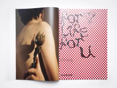
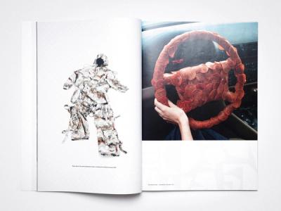
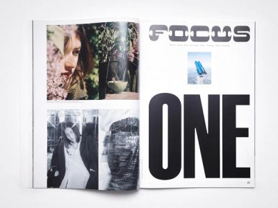
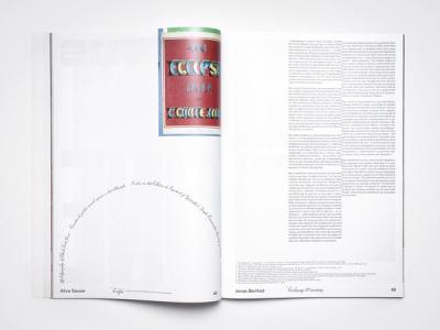
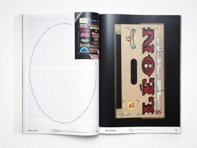
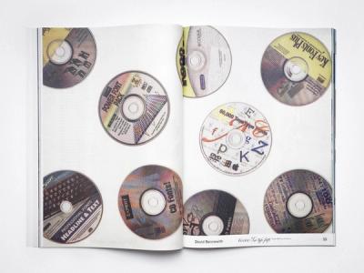
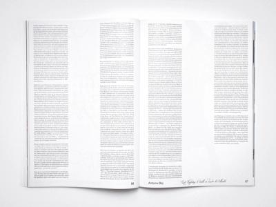
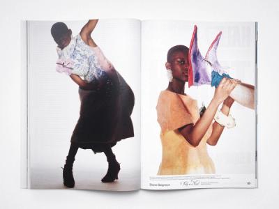
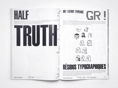
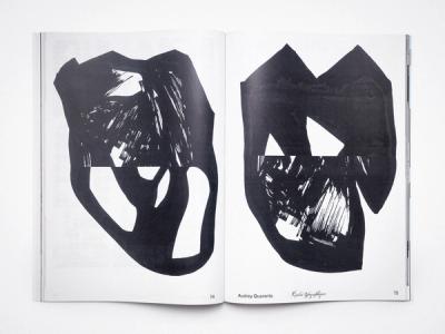
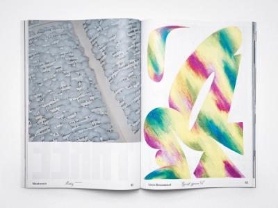
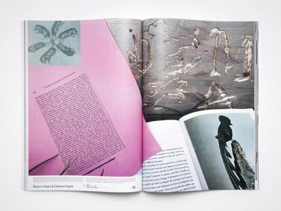
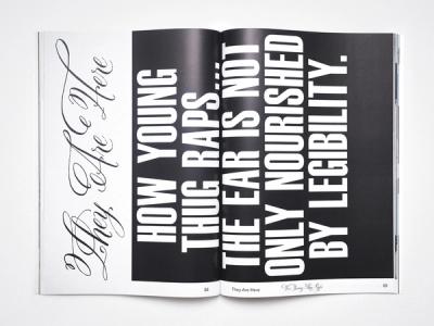
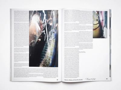
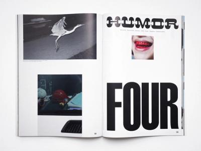
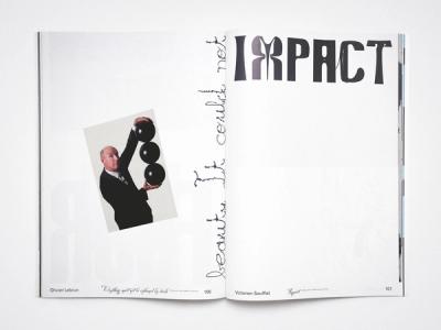
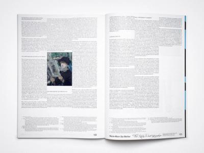
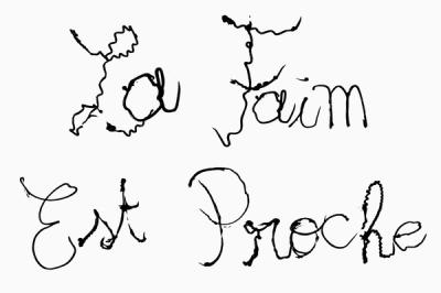
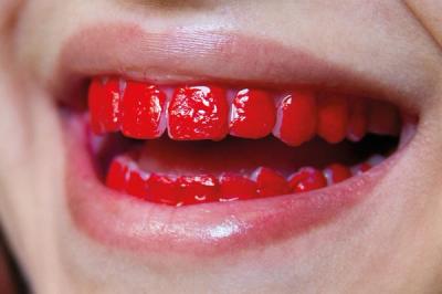
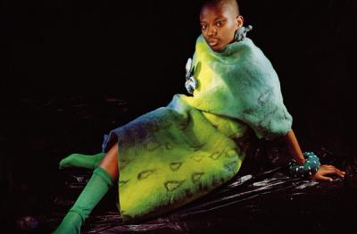
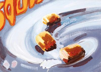
Legibility vs visibility vs readibility, for this first issue of the Revue Diorama Serie, we wanted to approach typography through the notion of taste, extravagance. Questioning “the typographical quarrels of the moderns”: the balance between a typography designed to be read or to be seen, as material to seduce, like fish lures, as advertising tool. Artisitic content of the book are very heterogenous ranging from photography to text, including sculpture and painting. In this issue, playing with chocolate and display typefaces, papers, scales and layout illustrate the notion of excess in typography and the idea of “feeding the eye” mentioned by Baudin; when illegibility as gourmandise become an act of designing.
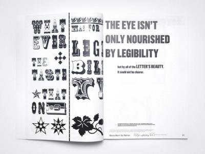
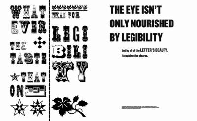
“ONE MUST ADMIT: WHATEVER THE TASTE THAT ONE HAS FOR LEGIBILITY, CLEARNESS AND TRANSPARENCY. IT ISN'T ALWAYS FOR EVERYONE. THE EYE ISN'T ONLY NOURISHED BY LEGIBILTY BUT BY ALL OF THE LETTER'S BEAUTY. IT COULD NOT BE CLEARER.” Fernand Baudin, 1977.
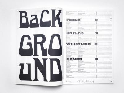
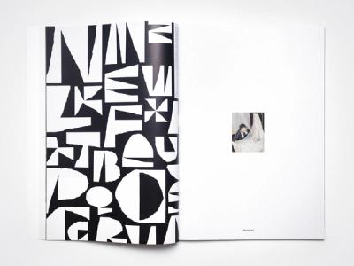
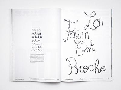
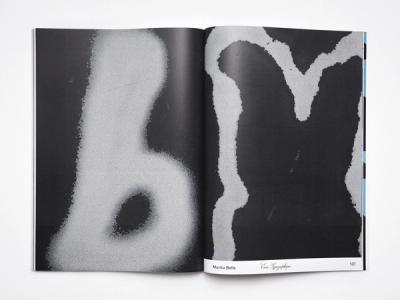
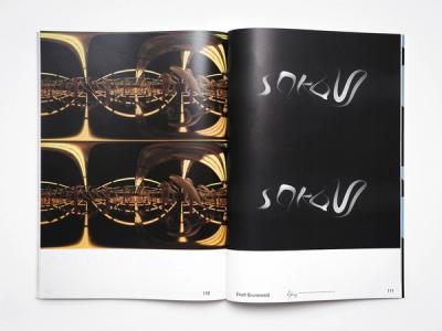
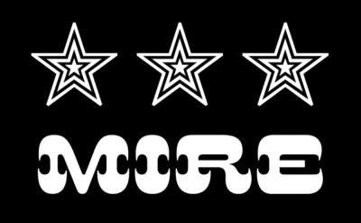
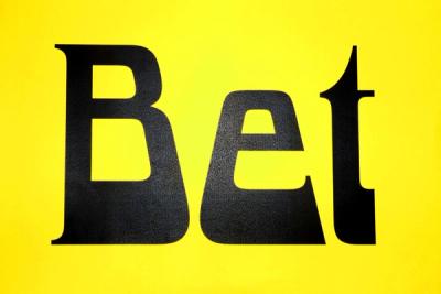
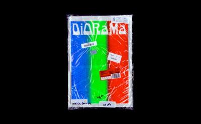
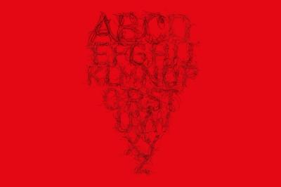
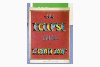
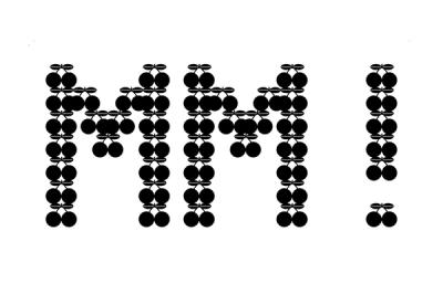
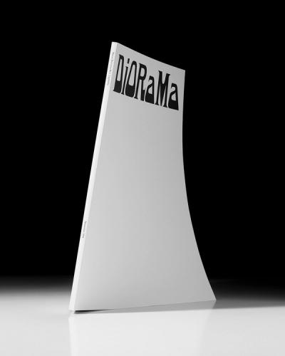
Four display typefaces were designed specifically for this issue: Bet, Twen, Mire and Fondante. The first three are drawn from the tradition of wood type (beginning of typefaces for adverts during the nineteenth century). While Fondante is the result of a collaboration between artist Clara Pasteau and chocolate Chef Romain Guy. For the first issue, the typeface Bet adorns the front cover of the revue, then introduces the definition of the word on the opening pages, as a generic / type specimen. Also, this large and silent cover is an elegant and minimal way to refer to the codes of the magazine object which is how we like to see our collection of typespecimens’ revue: a popular type of book but in an artist book direction.
Editor
Diorama Type Partners
Art Direction and Design
Marie-Mam Sai Bellier – Guillaume Sbalchiero
Editorial Text
Matthieu Cortat, Marie-Mam Sai Bellier
Contributors
ViewPaul Andali, Manon Bachelier, Claire Barrault Marika Belle, Laurence Bellier Victoria Bellier, David Bennewith, Jonas Berthod Fred Birdsall, Louise Boiron, Hugo Boutry, Louis Brousseau, Bureau Brut, Marion Cachon, Bruno Carbonnet, Maxime Castagnac, Léo Castel, Benoît Clément, Alain Couraud Matthieu Cortat, Alexis Cros, Sébastien Davilla, Eliott Déchamboux, Valentin Defaux Guy Demaysoncel, Jordan Derrien, Dio Dinamo Typefoundry, Floris Dutoit, Clément Faydit, Diane Gaignoux, Alaric Garnier, Clément Gicquel Nicholas Goudket, Quentin Goujout, Annija Grīsle Eliott Grunewald, Léa Guintrand Amaury Hamon, Julien Humbert, Camille Jacoby, Valentin Kaiser, Ministère Des Petites Choses (Noémie Lacroix) La Direction, James Langdon, Hugo Laporte, Thomas Le Provost, Olivier Lebrun, Steven Lenoir, Simon Lextrait, Roxanne Maillet, Meatwreck (Mitra Saboury and Derek Paul Boyle), John Morgan, Jules Moskovtchenko, Marcel Mrejen, Motoki Nakatani, Alain Papazian, Clara Pasteau, Axel Pelletanche Thévenart, Simon Penard Thomas Petit, Camille Pogu, Auriane Preud’homme, Audrey Quaranta, Quentin Rebierre-Roux Alice Savoie, Victorien Soufflet, Marine Stephan, They Are Here, Adrien Vasquez, Rozenn Voyer, Felix Weigand
Diorama typefaces
Bet and Twen (Guillaume Sbalchiero) Mire (Marie-Mam Sai Bellier) Fondante (Clara Pasteau) Mesh (Marie-Mam Sai Bellier)
Format
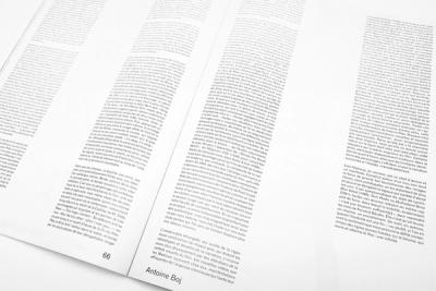
260 × 360mm, 128 pages, CMYK Offset
Printing House
KOPA Printing House (Kaunas, Lithuania)
Cover
Black offset printing and embossing
Inserts
Black and white Poster (Marine Stephan) Flyer CMYK (Olivier Lebrun)
Proofreading
Auriane Preud'homme, Thomas Hanus, Catherine Guiral
Diffusion
ISSN 2679-8980
Copies
500
Price
€30,00
Legal Deposit
February 2020


