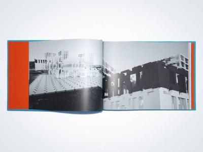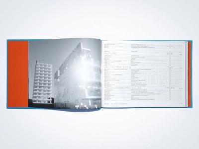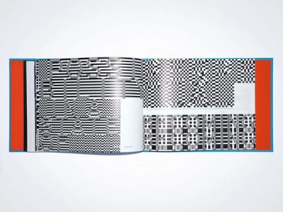
REVUE DIORAMA NO.2, GEOMETRIC CITY
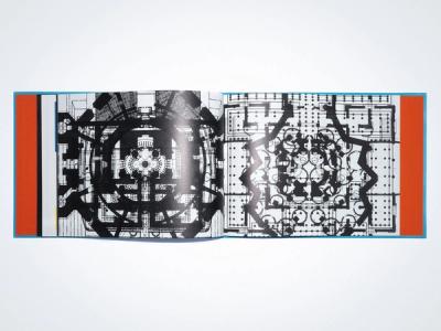
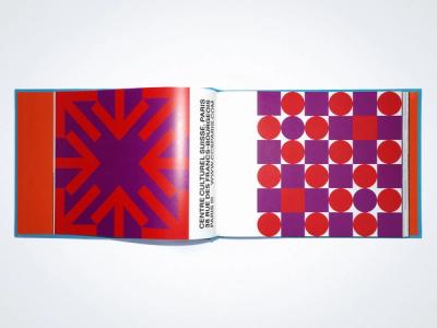
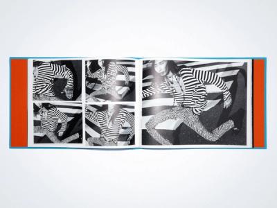
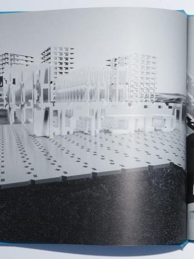
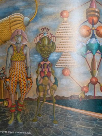
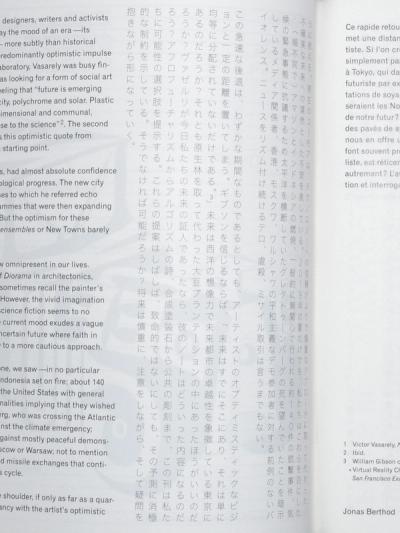
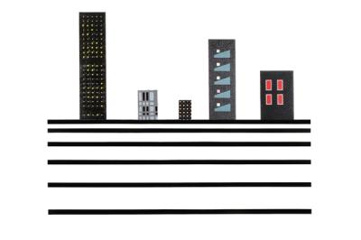
Victor Vasarely’s vision takes us back to the post-war years in which one could believe that mankind would be liberated through rationalization, innovation and machines. But in a world where capitalistic-driven innovation has largely accelerated the pace of global warming and where social inequalities have never been so blatant, it has become clear that redemption through rationalization is merely a myth. In a collision between time and dreams, this standardized vision of a better world invites us to take stock of our own position. More than 50 years later, what has become of such hope?
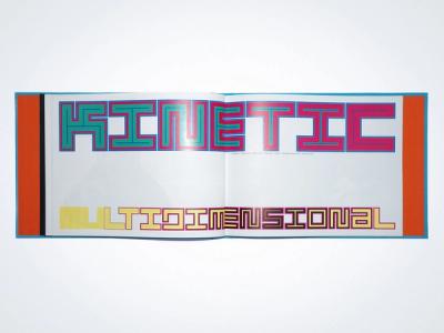
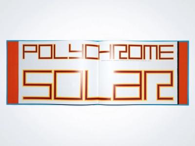
“FUTURE IS EMERGING WITH THE NEW GEOMETRIC CITY, POLYCHROME AND SOLAR. PLASTIC ART WILL BE KINETIC, MULTIDIMENSIONAL AND COMMUNAL, ABSTRACT FOR SURE AND CLOSE TO SCIENCE.” Vasarely, 1953.
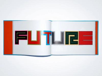
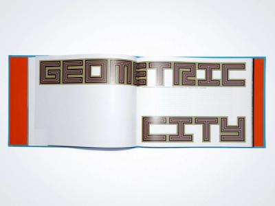
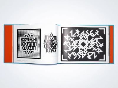
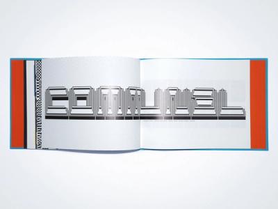
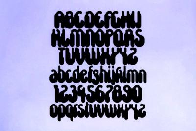
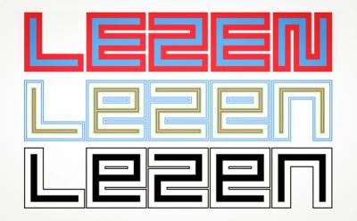
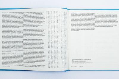
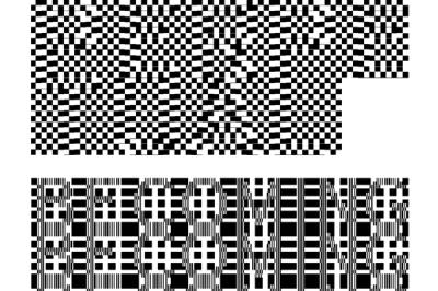
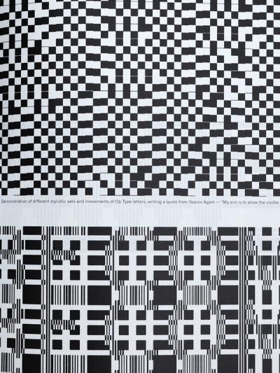
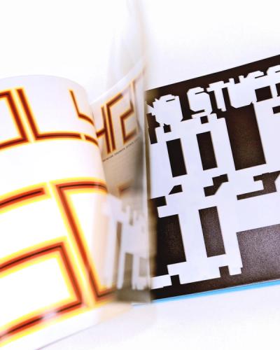
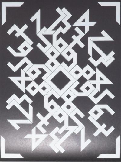
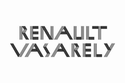
Today, we are witnessing the fall of the positivist ideology, whose attempted reforms by the heirs of a rigid and exacerbated modernism have failed. In typography, the frenetic search for the new alphabet —with its geometric, efficient, and stylized forms— is at is peak. Most of these eccentric standardizations have now fallen into the dumping ground of the Vox classification of fantasy typefaces. We want to evoke them through our titling typefaces for this issue through both Lezen and Mesh. We chose Mesh to dress the Diorama logotype on the front cover and developp the definition of the word as a type specimen generic in the middle of the book and decided to develop digitally Astronef by Jean Alessandrini.

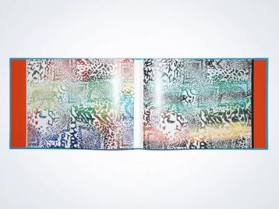
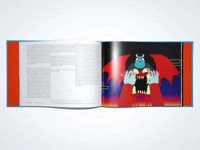
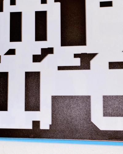
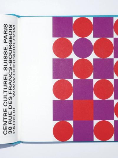
By using four colors for the different covers of the revue, we wanted to give the publication a pop and ambiguous dimension, citing Vasarely’s work with color variations and referring to Andy Warhol’s four part paintings. The hardcovers are produced by the Clément company in Nancy. In collaboration with Thomas Noël and Jasmin Muharemovic, from the Créanog workshop in Paris, we were able to produce a unique work of reinterpretation of the Diorama logo in bas-relief through embossing and gilding. This hard cover with stamples create a mix between industrial and traditional binding references.
Editor
Diorama Type Partners
Art Direction and Design
Marie-Mam Sai Bellier (Diorama Type Partners) and Guillaume Sbalchiero
Editorial Text
Jonas Berthod, Marie-Mam Sai Bellier and Nicolas Pirus
Contributors
ViewAbyme Type Foundry with John Morgan, Adrien Vasquez & Rudy, Jean Alessandrini, Paul Andali, Josefina Anjou, Elsa Audouin & Julien Humbert, Raoul Audouin, Manon Bachelier, Alexandru Balgiu & Olivier Lebrun, Jonas Berthod, Claire Barrault, Kévin Bichaud, Karina Bisch, Black(s) to the future with Nicolas Pirus, Fallon Mayanja, Mawena Yehoussi & Josefa Ntjam, Antoine Boj, Thérèse Boon Falleur & Aurèce Vettier, Cécile Bouffard, Oliver Boulton, Buero, Marion Cachon, Nicolas Chardon, Matthieu Cortat, Kimberley Cosmilla & Zuzana Kostelanskà, Quentin Coulombier, D’autant plus expertise, Marie De Brugerolle, Jean Delahaye, Dinamo Typefaces & Angelo Barbattini, Valentin Defaux, Floris Dutoit, Pari Ehsan, Marietta Eugster, Paul Haworth, Valentin Herfray, Jacquemus, Tomonari Kawano, Sohee Kim, Studio Kiösk, David Kramer, Noémie Lacroix (Ministère des petites choses), Hugo Laporte, Lou-Maria Le Brusq, Jungen Lee, Clément Lemaire, Marine Leleu, Romain Lenancker, Simon Lextrait with Jules Moskovtchenko, Hamish Wirgman & Kamil Sznajder, Juliette Lizotte, Roxanne Maillet, Shinnosuke Miyamoto & Motoki Nakatani, Christian Monaghan (Eaten Alive Illustrations), Marc-Henri Ngandu & Jamie-Maree Shipton with Tamayo Yamamoto, Lulu Reynolds (Select Model London) & J’nae Phillips, Paula Olaz, Officeabc, Clara Pacotte, Baptiste Poligné, Radeau Studio, Christophe Scarpa, Victorien Soufflet, Laurine Schott, Spaceless Gallery with Béatrice Masi, Rémi Caulliez, Jayde Cardinalli, Quentin Chevrier, Stéréo Buro, St-Henri Library, James Tennessee Briandt, Estelle Vanmalle, Pierre Vanni, Vier 5, Rozenn Voyer, Marine Zonca.
Diorama typefaces
Astronef (Jean Alessandrini – Diorama Type Partners) Lezen (Guillaume Sbalchiero – Marie-Mam Sai Bellier) Mesh (Marie-Mam Sai Bellier)
Format
200 × 260mm, 212 pages, CMYK Offset
Cover Color Variation
ViewPOP'STICK PINk (Exterior: pink / Lettering: red / Interior: blue), CALIFORNIAN CITY BLUE (Exterior: blue / Lettering: rainbow gradient / Interior: orange), ODD' GREEN (Exterior: green / Lettering: gold / Interior: pink), ORANGE'DELIC (Exterior: orange / Lettering: iridescent pearl soft pink), LIMITED EDITION, 25 copies (Exterior: blue / Lettering: red / Interior: orange).
Hot foils
Thomas Noël & Jasmin Muharemovic, Créanog (Paris, France)
Hardcovers
Clément SAS (Nancy, France)
Binding
Legrand SAS (Fontenay-Sous-Bois, France)
Printing House
KOPA Printing House (Kaunas, Lithuania)
Inserts
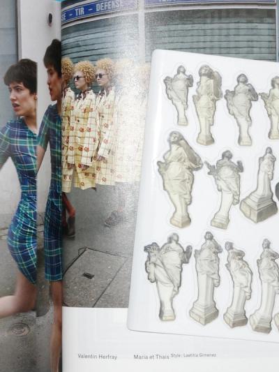
ViewRiso letter tract (St-Henri Library) Glossy sticker sheet CMYK (Valentin Herfray) Hot foil gold textile bookmark (Alexandru Balgiu and Olivier Lebrun) Flyer CMYK (Quentin Coulombier)
Proofreading
Antoine Boj (French), Julian Myron (English), Motoki Nakatani (Japanese)
Gaming
Marie-Mam Sai Bellier (Art Direction), Clément Lemaire (Game developper), Paula Olaz Moratinos (Music composer)
Diffusion
ISSN 2679-8980
Copies
1000 (250 per color)
Price
€40,00
Legal Deposit
November 2018


